This tutorial details the EASY way to create a simple mobile app, with the bulk of the code running on your web server (we would recommend using Ubuntu with Apache or NGinx on something like a Digital Ocean Droplet). You don’t need to do the actually Android/iOS development bit yourself, but by all means you can skip our step about this and do that end yourself if you want!
Here are the 7 steps we will go though.
- Make your HTML mobile friendly
- Minify your HTML
- Obfuscate any PHP code you might use
- Minify your JS
- Minify your CSS
- Convert JPG and PNG to WebP
- Create Your Webview App!
The idea is that we build a really mobile friendly webpage, make sure it loads super-fast (even on mobile internet) and then package it up in what’s called a “webview” app – basically an app that loads our webpage and nothing else.
As easy as this sounds, there are a few steps to achieve total perfection, so let’s get on with it.
Make your HTML mobile friendly
Responsive web design is about creating web pages that look good on all devices. A responsive web design will automatically adjust for different screen sizes and viewports, especially mobile devices.
The most important step to creating a responsive website is to add the following <meta> tag to all your web pages (or the header page that all other pages use):
<meta name="viewport" content="width=device-width, initial-scale=1.0">
You should also try and center align most of the content, use large fonts and consider that the user will most likely be viewing the page vertically (ie. go for a single column layout). Most importantly, KEEP IT SIMPLE. And do extensive testing at this point using various mobile devices and their default browser.
Minify your HTML
Once you are happy with all your HTML, we need to ensure it loads it the absolute fastest possible time. So what we do is basically compress it – removing all the blank lines, empty spaces, comments etc until the file is as small as it will possibly go. There are many sites that do this for you, like this one.
We want our HTML to go from this:
<html>

<head>

<title>My App</title>

<meta name="viewport" content="width=device-width, initial-scale=1.0">

<link rel="stylesheet" href="css/mystyle.css">

<script src="js/script.js"></script>

</head>

<body>

<form action="welcome.php" method="post">

Name: <input type="text" name="name"><br>

E-mail: <input type="text" name="email"><br>

<input type="submit">

</form>

</body>

</html>
to this:
<html><head><title>hello world</title><meta content="width=device-width,initial-scale=1"name="viewport"><link href="css/mystyle.css"rel="stylesheet"><script src="js/script.js"></script></head><body><form action="welcome.php" method="post">Name: <input name="name"><br>E-mail: <input name="email"><br><input type="submit"></form></body></html>
thus reducing the load time of the page.
Obfuscate any PHP code you might use
The PHP code in our app is the “secret sauce”. It’s where the actual magic happens. While most of your PHP code is handled server-side and the user only sees the output, it’s still a good idea to “obfuscate” code in your production environment for security purposes if nothing else. This involves making your PHP really, really difficult to read for anyone who might gain access to it somehow. Today, we are going to use this online tool.
Let’s imagine the following is our welcome.php for the HTML form in the previous steps.
Welcome <?php echo $_GET[“name”]; ?><br>
Your email address is: <?php echo $_GET[“email”]; ?>
?>
after obfuscation, it resembles this:
<?php goto jjQQl; jjQQl: echo "\x3c\150\164\x6d\154\x3e\74\x62\x6f\x64\x79\76"; goto ZMJck; ZMJck: ?>

Welcome <?php goto rNVm4; pD_CY: echo $_GET["\145\155\x61\151\x6c"]; goto mDl6P; mDl6P: ?>

<?php goto PXodn; rNVm4: echo $_GET["\156\141\x6d\x65"]; goto p6bkU; PXodn: echo "\x3c\x2f\x62\x6f\x64\171\x3e\74\57\x68\164\155\154\76"; goto u7tmS; p6bkU: ?>

<br>Your email address is: <?php goto pD_CY; u7tmS: ?>
Pretty hard to read, isn’t it?
While you CAN also minify your PHP, it is not always recommended and does not have any real benefit in terms of the page load time on the client end. Btw, ALWAYS backup a file before obfuscation in case you need to modify code at a later date!
Minify your JS
Our HTML file references a JS file. There is not much point in our web page loading fast if one of the mentioned JS files is really, really big – so it’s a good idea to also minify all your Javascript. This can be done with this tool, or this one (there are MANY others). The best one we arrange the logic of the code for you. So:
function validateForm() {

let x = document.forms["myForm"]["fname"].value;

if (x == "") {

alert("Name must be filled out");

return false;

}

}
becomes
function validateForm(){let x=document.forms["myForm"]["fname"].value;if(x==""){alert("Name must be filled out");return false}}
or even better,
function validateForm(){if(""==document.forms.myForm.fname.value)return alert("Name must be filled out"),!1}
Minify your CSS
Similarly, we need to minify any CSS used by our web page, again to help with the loading time more than anything else (remember – apps must be FAST, or else users get annoyed real quick).
Let’s imagine this is our CSS file:
@font-face {

font-family: "handwriting";

src: url("fonts/journal-webfont.woff2") format("woff2"), url("fonts/journal-webfont.woff")

format("woff");

font-weight: normal;

font-style: normal;

}
@font-face {
font-family: “typewriter”;
src: url(“fonts/momot___-webfont.woff2”) format(“woff2”), url(“fonts/momot___-webfont.woff”)
format(“woff”);
font-weight: normal;
font-style: normal;
}
body {
font: 1.3rem sans-serif;
padding: 0.5em;
margin: 0;
background: #222;
}
form {
position: relative;
width: 740px;
height: 498px;
margin: 0 auto;
padding: 1em;
box-sizing: border-box;
background: #fff url(background.jpg);
/* we create our grid */
display: grid;
grid-gap: 20px;
grid-template-columns: repeat(2, 1fr);
grid-template-rows: 10em 1em 1em 1em;
}
After minification, this file is MUCH smaller.
@font-face{font-family:handwriting;src:url(fonts/journal-webfont.woff2) format("woff2"),url(fonts/journal-webfont.woff) format("woff");font-weight:400;font-style:normal}@font-face{font-family:typewriter;src:url(fonts/momot___-webfont.woff2) format("woff2"),url(fonts/momot___-webfont.woff) format("woff");font-weight:400;font-style:normal}body{font:1.3rem sans-serif;padding:.5em;margin:0;background:#222}form{position:relative;width:740px;height:498px;margin:0 auto;padding:1em;box-sizing:border-box;background:url(background.jpg) #fff;display:grid;grid-gap:20px;grid-template-columns:repeat(2,1fr);grid-template-rows:10em 1em 1em 1em}
Convert JPG and PNG to WebP
One of the biggest culprits when it comes to a slow loading web page is images. While JPG and PNG files are usually compressed by default, the new WebP format is better again.
WebP is a modern image format that provides superior lossless and lossy compression for images on the web. WebP lossless images are 26% smaller in size compared to PNGs. while WebP lossy images are 25-34% smaller than comparable JPEG images! WebP is natively supported in Google Chrome, Safari, Firefox, Edge, the Opera browser. So it makes sense to use it here.
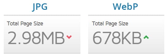
There is a multitude of online tools for converting to WebP, including this one. So if your web page uses any images, be sure to convert them.
Create Your Webview App!
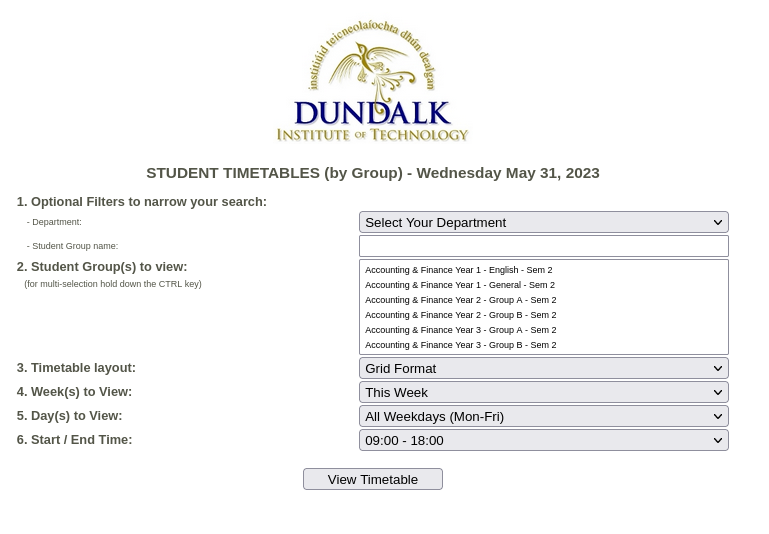
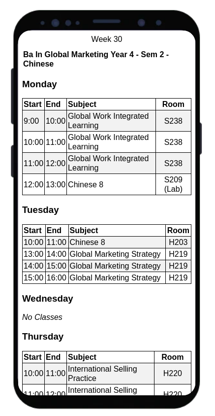
You are now ready to bring your mobile web page to mobile device users via a handy app. Once again, there are plenty of online tools to do this, or you can write your own. We’ve has some experience with https://www.webintoapp.com and in fact, this free service was used by our own Computer Services department to build the DkIT Student Timetables app (along with all the steps mentioned above).
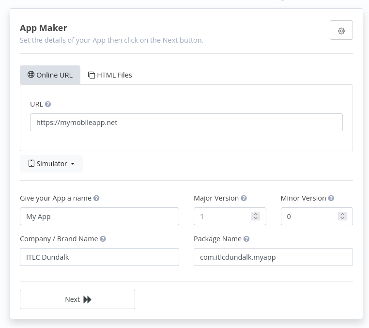
When finished, you will be able to download your APK file for testing, plus your AAB file for submitting to the Google Play Store. The same online tool produces all the code required to compile for Apple devices, for a nominal fee.
Conclusion
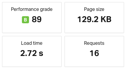
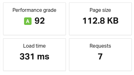
Super fast loading times and responsiveness are both critical when designing a web page for use in a webview app. For comparison here are the loading details of the standard version of https://timetables.dkit.ie versus the optimised version for use in the (responsive) mobile version.
As you can see, one page is not that much smaller than the other, but fewer requests are being made, and what is being requested is loading faster. These fractions of seconds make all the difference when it comes to designing mobile web content for use in an app (or otherwise).


